SHERDONNA
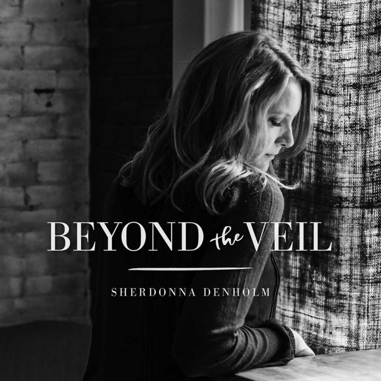
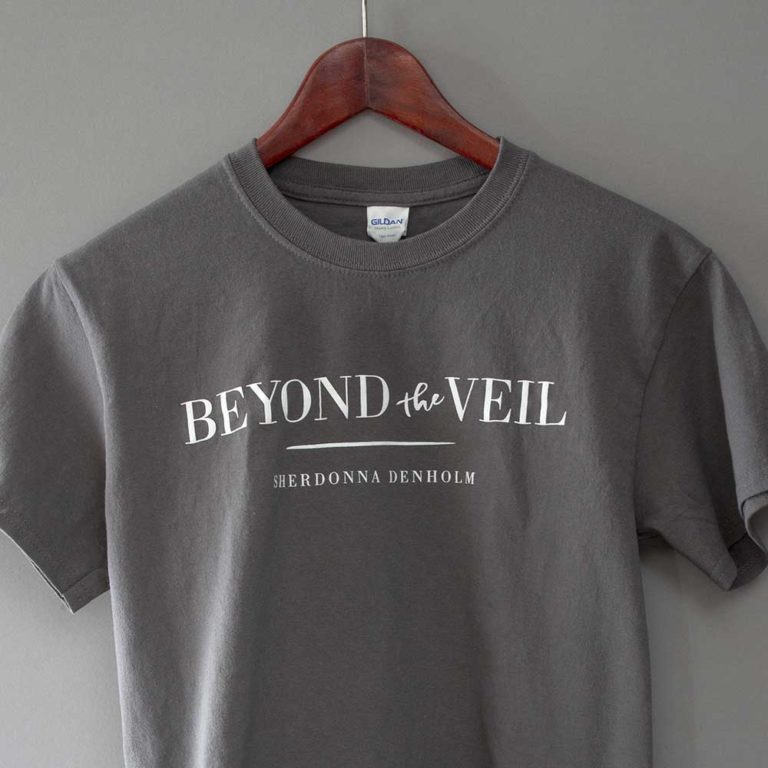
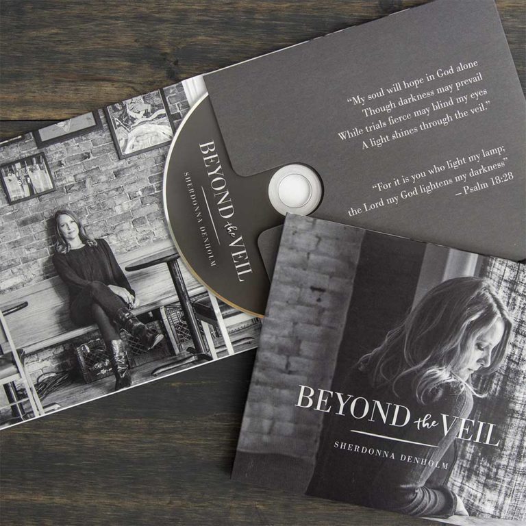
Sherdonna came to us with several ideas for the look and feel of her new album. Ultimately it was the portrait photography (Natalie Ulrich) that led the direction of the project. One of the shots fit perfectly with the album’s title song, playing with shadows and light. We then used a text treatment for the album logo in a modern serif interrupted by a more casual handwritten script that fit the tone of the album. All merchandising reflected the shades of gray and font style for consistency.


