Glenwood

auxano: Glenwood church of Christ

Over the past 10 years, we’ve had the privilege of working with Auxano, a company who specializes in helping churches and other non-profit organizations develop a branding strategy. Glenwood Church of Christ was one of those churches. From their mission statement which included “graciously helping a fallen world stand up again” we developed a logo that depicted a negative space cross (Christ as the center) created from standing pieces (relationships within the church and the surrounding community helping each other).

In addition to the logo, we created a color palette, strategy icon, business package, guest brochure and worship folder.

BACK TO PORTFOLIO

Missouri Dairy

missouri dairy association

The Missouri Dairy Association has been a client of ours for nearly 20 years. They came to us with a logo, which we’ve only updated slightly, keeping the dairy cow and state outline per the client’s request. In 2015, they began offering an educational convention for dairy farmers called the Heart of America Dairy Expo. We created a logo and look specifically for the conference. Over the years we’ve produced programs, postcards, banners, ads and newsletters.

BACK TO PORTFOLIO

QzFA

qzfa

The Quiznos Franchisee Association wanted a logo that expressed open communication between the franchisee owners and the corporate office. Using the color palette of the Quiznos brand, we designed a logo with open space within the ‘talking bubbles’ that represent communication between the two.

BACK TO PORTFOLIO

Next Level

Next Level

“We’re taking it up a notch … or two.” The client wanted his new logo to visually represent the philosophy of his new company. More materials to come … stay tuned!

BACK TO PORTFOLIO

Yoga Renaissance

Yoga Renaissance

YRcoverSmall

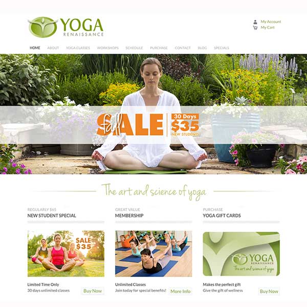
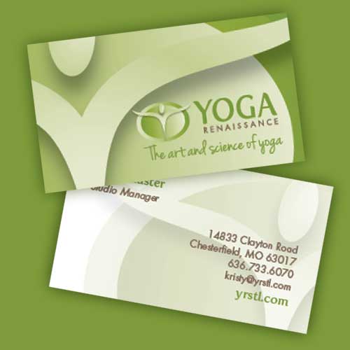
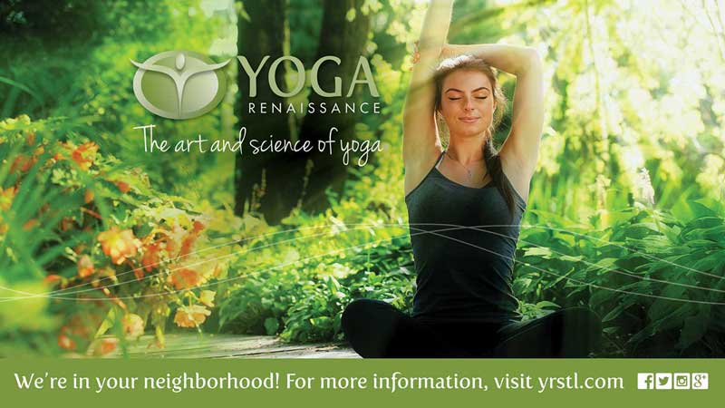
We had the opportunity to create a brand from the ground floor for Yoga Renaissance, a new concept studio in Town & Country, Mo. They brought a clear mission and passion — “to integrate mind, body and spirit through the art and science of yoga.” From there we created a logo that presented the idea in a direct, creative and artistic way. The brand mark transcends its space and represents the three-pronged mind/body/spirit wholeness. The organic and natural colors, as well as the flowing font were selected to communicate the authentic personality of the culture, while the classic, clean font for “renaissance” represents a distinctly Western approach to the practice, blending both contemporary and traditional font styles. This combination also reinforces the tagline, “The art and science of yoga.”

Additional graphic elements were added to further reinforce the brand:

Interconnected motion lines — This visual element, representing the inter-connectedness of mind/body/spirit is used to provide depth. When paired with another more geometric element or elements, this more organic element can accent and enhance the design. The lines also communicate movement and flow. The lines are equal in weight, showing the importance of all three together, yet not always at the same place at the same time.

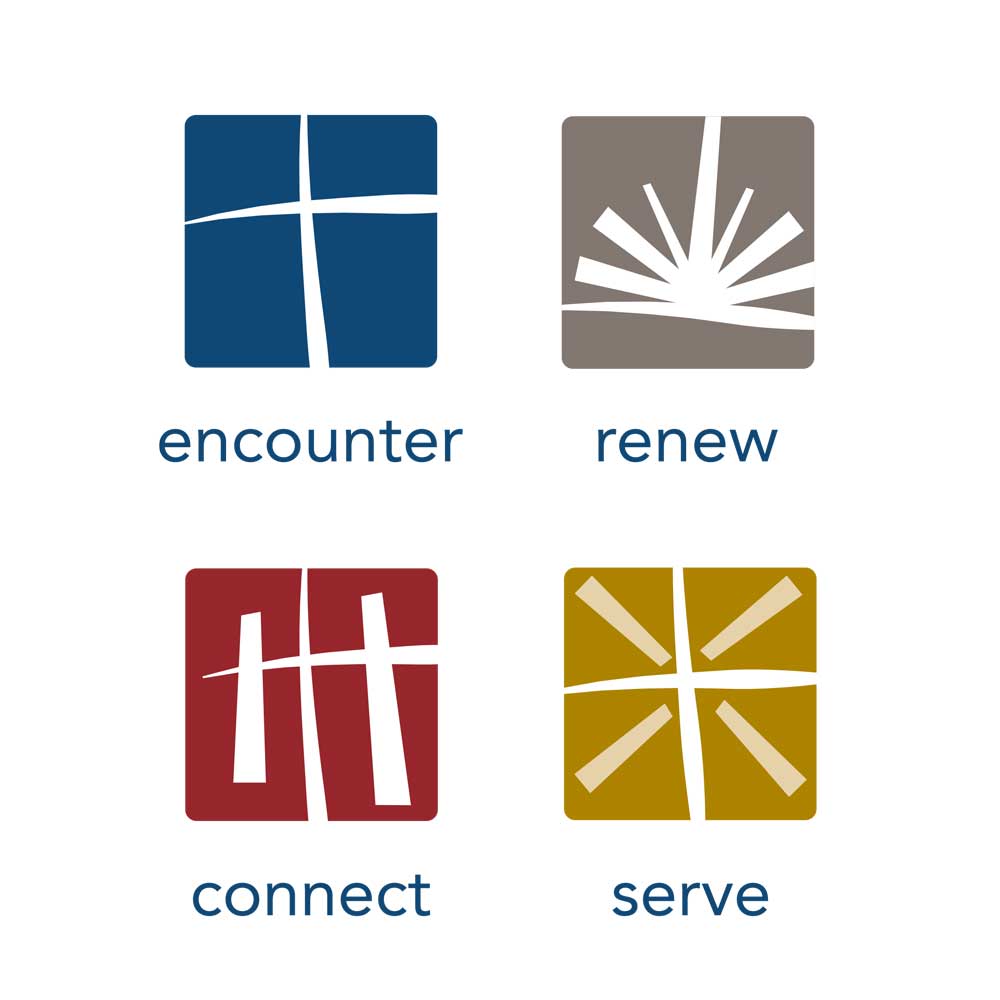
Strategy icons — The icons visually represent the core of yoga practice as an art and a science — dedicated to creating union between body, mind and spirit.
 
We chose a color palette for Yoga Renaissance that appeals to both men and women, creating a calm, grounded and peaceful environment while still exuding energy.
 
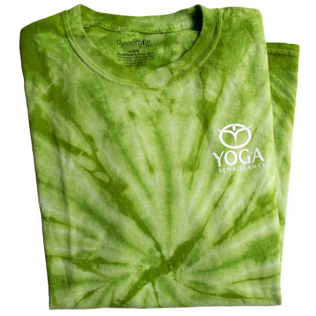
With a logo, fonts, colors, graphic elements and a photography style in place, we created a website, merchandising, digital media, email newsletters, business package, and marketing material — all reinforcing the Yoga Renaissance brand.
 
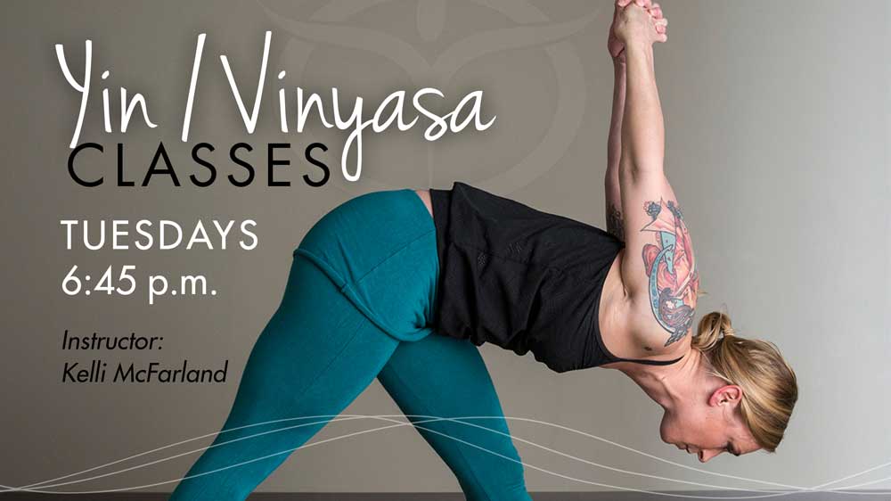
Photography for headline photo and class media slides: Brandon Rice.

BACK TO PORTFOLIO

Dakota

Dakota wetland partners, llc

Dakota Wetland Partners, LLC is a wetland mitigation banking company. Their primary focus is to provide compensatory mitigation to agricultural producers for wetland conversions approved under the Food Security Act in North and South Dakota. Their logo was designed to represent that conversion.

BACK TO PORTFOLIO

Oxbow

Oxbow land management

Oxbow, a land management company specializing in wetland and stream assessment, chose their company name to describe what they do. An oxbow, the u-shaped bend in the course of a river, sometimes gets cut off and becomes a wetland, which along with stream and river restoration, is their primary focus. Their logo was designed to visually represent this concept as well.

BACK TO PORTFOLIO

Sherdonna

SHERDONNA

Sherdonna came to us with several ideas for the look and feel of her new album. Ultimately it was the portrait photography (Natalie Ulrich) that led the direction of the project. One of the shots fit perfectly with the album’s title song, playing with shadows and light. We then used a text treatment for the album logo in a modern serif interrupted by a more casual handwritten script that fit the tone of the album. All merchandising reflected the shades of gray and font style for consistency.

BACK TO PORTFOLIO

Cignal

Cignal Systems, Inc.

An audio/video/lighting design and integration company, Cignal Systems needed a logo that stood apart from the tech-based competition, showing not only proven technical expertise but also conveying the innovative and architectural way in which designs were implemented … creative solutions that artfully co-exist within their environment.

BACK TO PORTFOLIO

Treats Unleashed

treats unleashed

Treats Unleashed came to us with a fairly established brand; it just needed a refresh and some help with consistency. After nailing down the color palette, fonts and other brand elements, we created shopping bags, flyers, store signage, print and digital ads, website banners, graphics for eNewsletters, t-shirts and packaging for their private label grooming products.

BACK TO PORTFOLIO