Jupiterhill Creative

Jupiterhill Creative

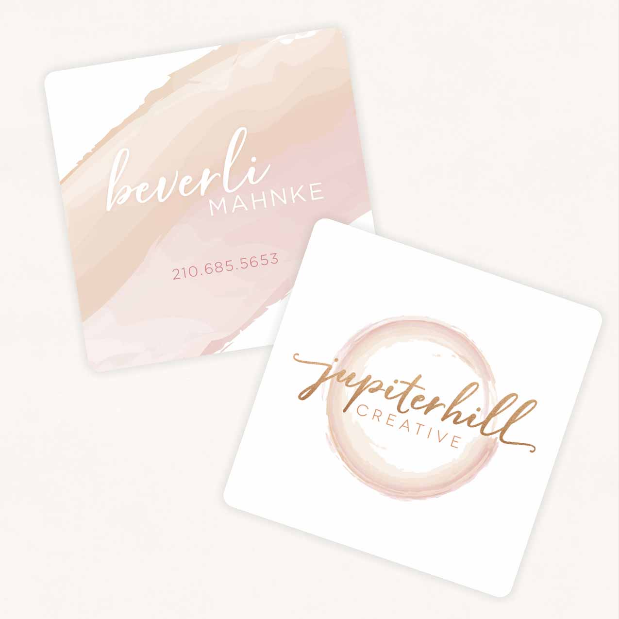
JupiterHill Creative specializes in wedding design, planning and management. They plan the entire affair from crafting a budget, choosing a venue, scheduling dress fittings, designing invitations and planning the honeymoon or just manage the big day so that the family can relax and enjoy being in the moment.

Their logo was designed to feature the creative aspect of wedding planning, while also thinking outside of the box. The two colors emphasize the couple’s individual tastes and interests, but intertwined in the shape of the ring, the symbol for eternal love.

BACK TO PORTFOLIO

Mike Weinberg

Mike Weinberg

Mike came to us looking for graphics for a premium online video coaching series he was promoting. He had a logo for his main brand but needed help with a logo for the series. We created a sub-brand logo specifically for the video series that played off of his original logo, refreshed his brand colors, nailed down typography, designed social media posts, and created accompanying pieces to the video series that were clean and consistent.


Leon Bronstein

Leon Bronstein exHibition catalog

It was a joy to be able to look at Leon’s sculptures while putting together this catalog for an exhibition at Saint Louis University Museum of Art. The book features themed sections which are divided by a ‘warm and happy’ color palette as requested by the artist to represent the direction his current work is taking him. The main colors chosen for the covers were inspired by the bronze material and green patina on Leon’s work. The fonts used are organic and clean, but with some movement. The page layout is such that it leaves open space for exploration.


Coro

focus st. louis: coro fellowship

FOCUS St. Louis hired us to create a brochure for the Coro Fellowship program. They had a logo, but no branding specific to the Coro program in St. Louis. We created an interesting z-fold brochure with an eye-catching orange to complement the blue in their logo.


BACK TO PORTFOLIO

MATSIF

MICHIGAN association of timbermen self-insurers' fund (MATSIF)

MATSIF was one of our very first clients and has remained so for nearly 20 years. When they approached us about doing some marketing materials, we took the opportunity to update their brand as well. We completely overhauled their website to be consistent in theme. The site now also provides online premium payments for their members, which was previously unavailable.

BACK TO PORTFOLIO

AgGroup

The Ag group at keb

The AgGroup at KEB is a uniquely qualified team of agribusiness professionals who serve within the larger framework of Kerber, Eck & Braeckel LLP, a firm specializing in auditing, accounting, management consulting and asset management. They wanted to create a sub-brand for their niche market, which related closely to their specific clients. We developed the AgGroup logo using the font and blue brand color from the original KEB logo and also used the swish as a graphic element. From there we developed marketing collateral which includes a pocket folder, a template for articles and team bios, a brochure, flyers and PowerPoint templates.

BACK TO PORTFOLIO

MAC

missouri athletic club

The Missouri Athletic Club hired us in 2014 to give their monthly Cherry Diamond magazine an update. We took it a step further by giving them a cohesive brand complete with font choices, color palette and graphic elements. These elements have become the overarching brand for MAC, designed to be consistent through all internal and external communications throughout all departments.

BACK TO PORTFOLIO

G-Biosciences

Printer's Finishing Services: G-Biosciences

G-Biosciences already had a logo and symbol (Protein Man), but needed us to create product packaging in many different sizes.

BACK TO PORTFOLIO

Christ Church School

Auxano: Christ Church School

Christ Church had enlisted Auxano’s help in the past for their logo and branding strategy. They were so pleased they asked to have a strong visual brand created for their school also. We developed this sub-brand with elements from the overarching Christ Church brand — fonts, colors and graphic elements — and combined them to make an appropriate logo and look for the Christ Church School.

BACK TO PORTFOLIO

Harvest

Auxano: Harvest Church

Harvest Church, a multi-site church with five locations, had a well-established brand in place when we began working with them. During this time they also went through a brand refresh. It was our job to create production pieces to fit their brand for all five campuses: annual reports, Sunday bulletins, announcement slides, Facebook sliders, postcards, lobby posters, website graphics and much more.

BACK TO PORTFOLIO